

League One scatter graphics: 2024-25
A full-season comparison of attacking and defensive performance

For anyone who is seeing them for the first time, they are explained fully in this post.
Shot dominance
First of all, here is how the number of shots taken by each club compares with those they face in return. The average number of shots taken per match is on the horizontal and the average number faced is on the vertical, so bottom right (take plenty, allow few in return) is good while top left (take few, allow plenty) is bad.
The stripes are like contours: the greener the stripe, the better the performance (and vice versa for red). The matching labels that sit around the edges of the chart indicate how good (or bad) it is to be in each shaded area, based on the historical distribution of teams over previous seasons.
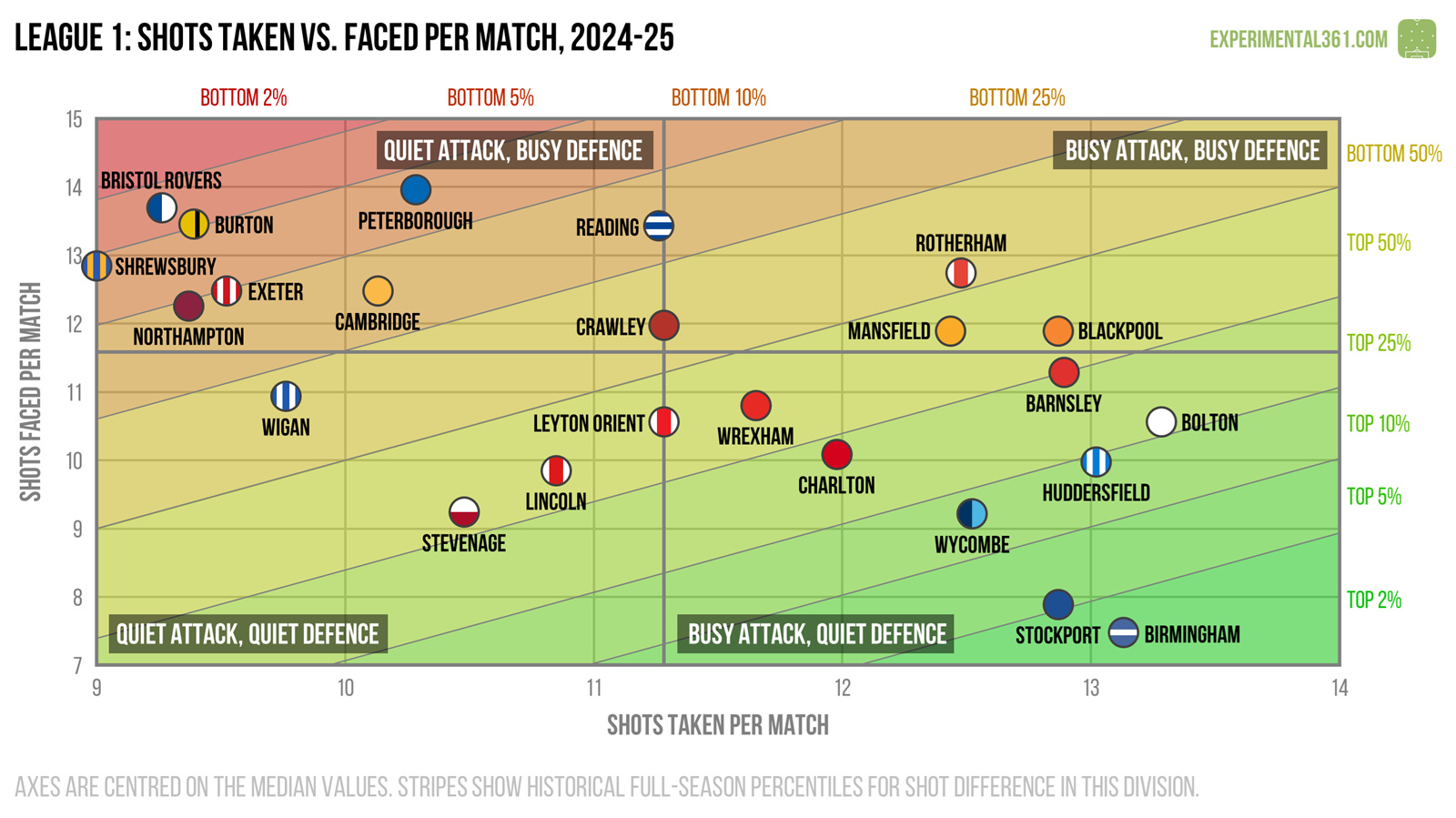
Champions Birmingham were the only one of the three promoted teams who stood out for their shot dominance, creating the second most chances and allowing the fewest.
At this superficial level it’s surprising to see that Crawley were relegated, as in raw shot terms they looked pretty average. The remaining graphics will shed a bit of light on this.
Attacking effectiveness
Now let’s look at attacking alone. The horizontal axis stays the same as in the graphic above, but now the vertical shows the average number of shots needed to score each league goal. Therefore bottom right is good (taking lots of shots and needing fewer efforts to convert) and top left is bad.
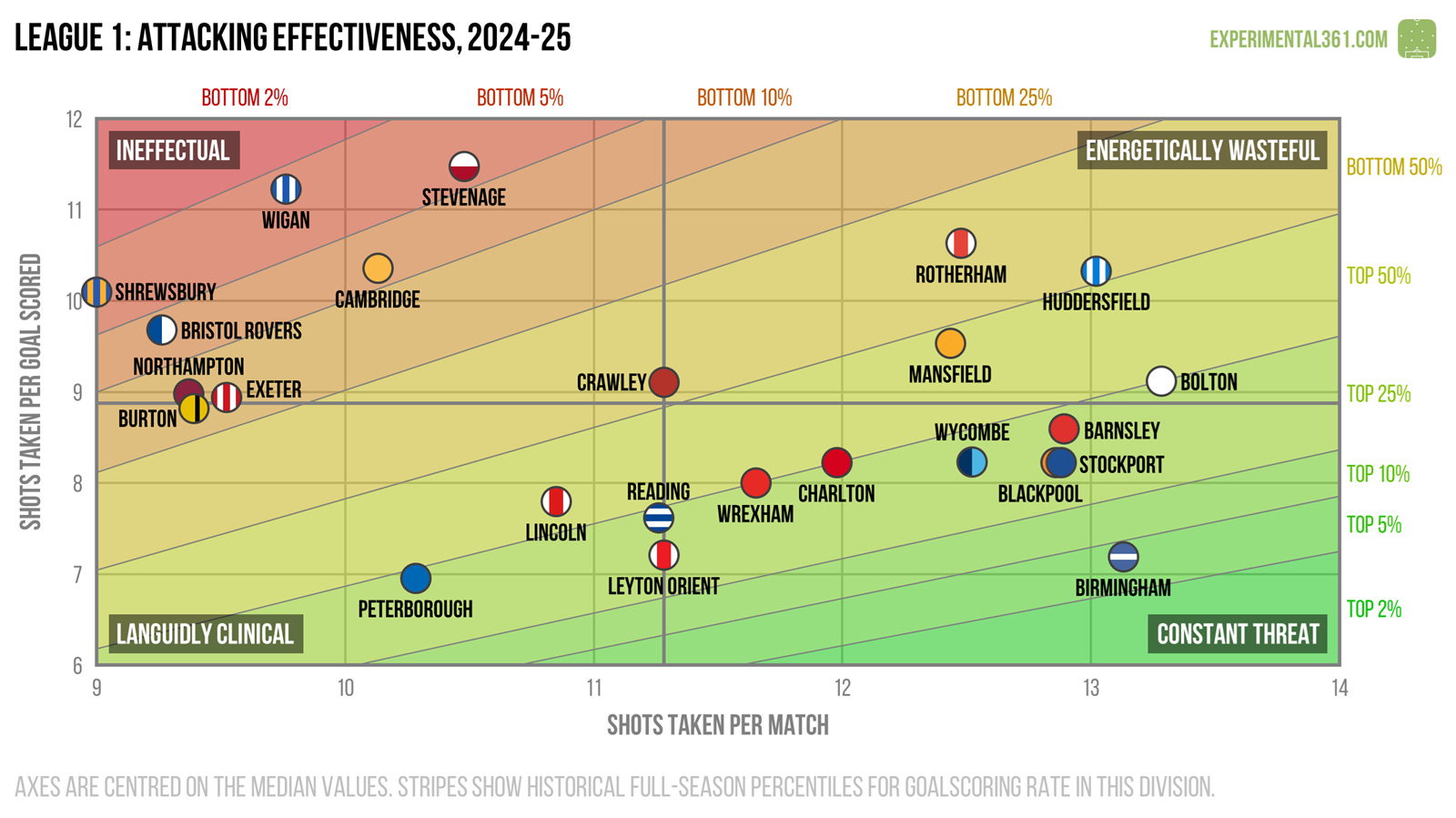
There’s a noticeable divide here between the eight teams in the top right corner - who struggled in front of goal this season - and everyone else.
Stevenage and Wigan struggled to convert their chances but (as the next graphic shows) were able to eke out a mid-table finish thanks to their strong defences.
Defensive effectiveness
Next let’s look at the defensive situation – basically take the above chart and replace the word “taken” for “faced” on both axes. Now top left is good (facing fewer shots and soaking up more for each goal conceded) and bottom right is bad.
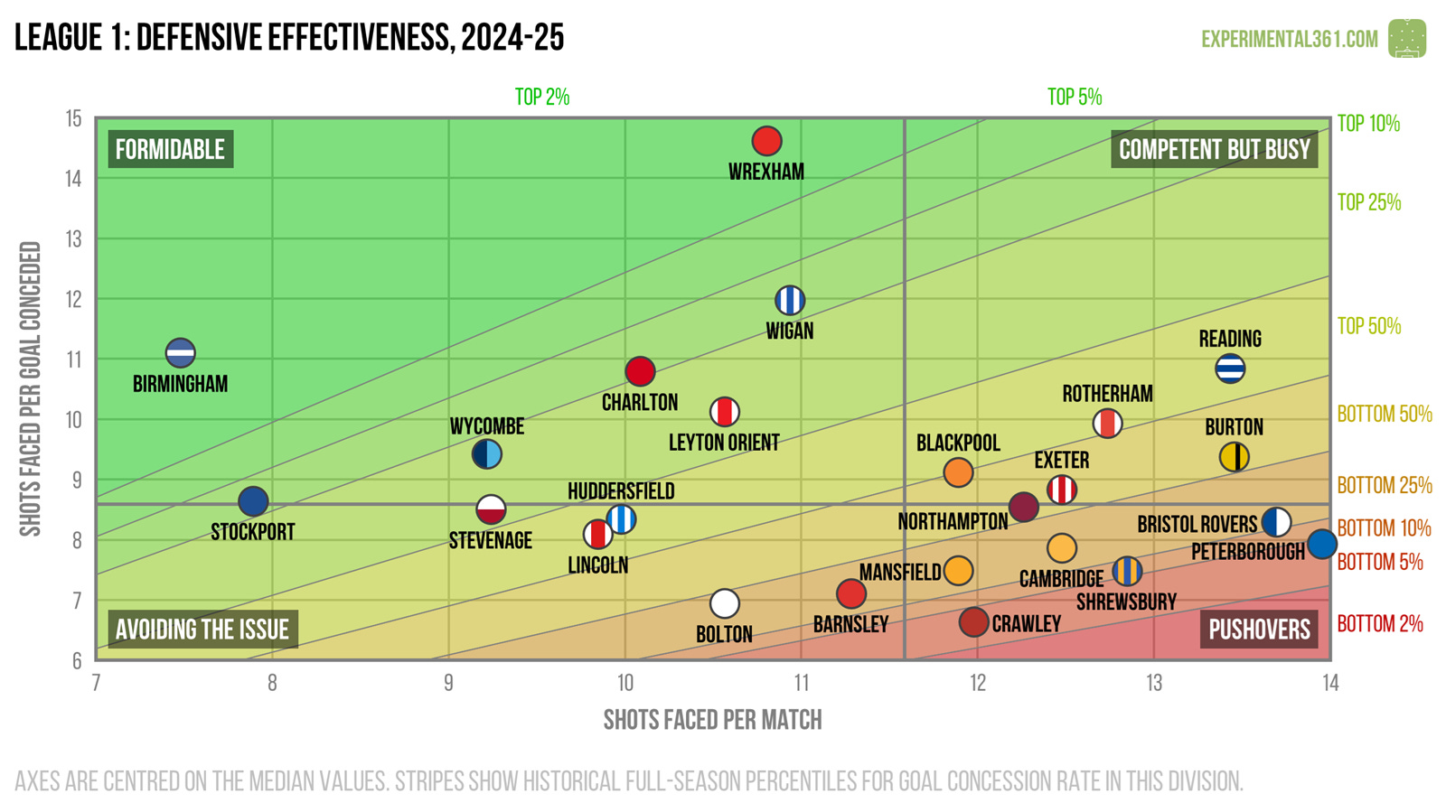
Wrexham were only a little above-average on the previous two charts, but here we can see that their promotion campaign was built on defensive resilience. Despite allowing slightly fewer shots, Bolton conceded over twice as many goals.
Here’s where things went wrong for Crawley: they the leakiest defence in the league, at least in terms of how many attempts it took to find their net.
Expected goals
Finally here's a version of the first graphic that uses expected goals (xG) instead of shots, which should be a more accurate reflection of attacking and defensive quality. These are calculated using my own somewhat ancient model based on a relatively simple dataset, but in practice it tends to agree pretty well with the more advanced ones out there.
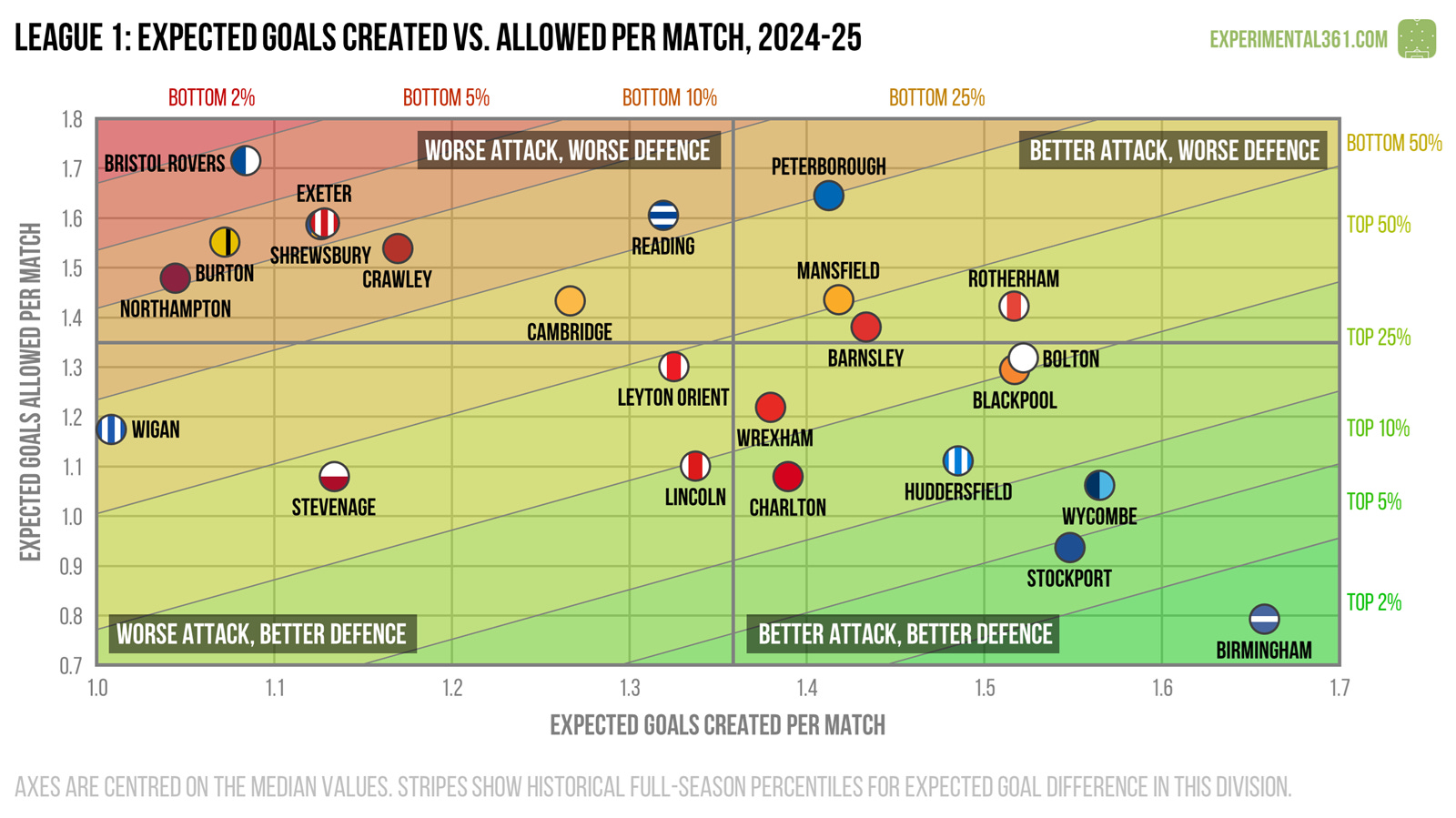
When we adjust for shot quality, Birmingham stand out as deserving champions, with the best performances at both ends of the pitch.
Stockport and Wycombe should both be capable of another promotion challenge, while Exeter, Burton and Northampton may need to shake things up if they’re to avoid a relegation battle.