

League Two scatter graphics: 2024-25
A full-season comparison of attacking and defensive performance

For anyone who is seeing them for the first time, they are explained fully in this post.
Shot dominance
First of all, here is how the number of shots taken by each club compares with those they face in return. The average number of shots taken per match is on the horizontal and the average number faced is on the vertical, so bottom right (take plenty, allow few in return) is good while top left (take few, allow plenty) is bad.
The stripes are like contours: the greener the stripe, the better the performance (and vice versa for red). The matching labels that sit around the edges of the chart indicate how good (or bad) it is to be in each shaded area, based on the historical distribution of teams over previous seasons.
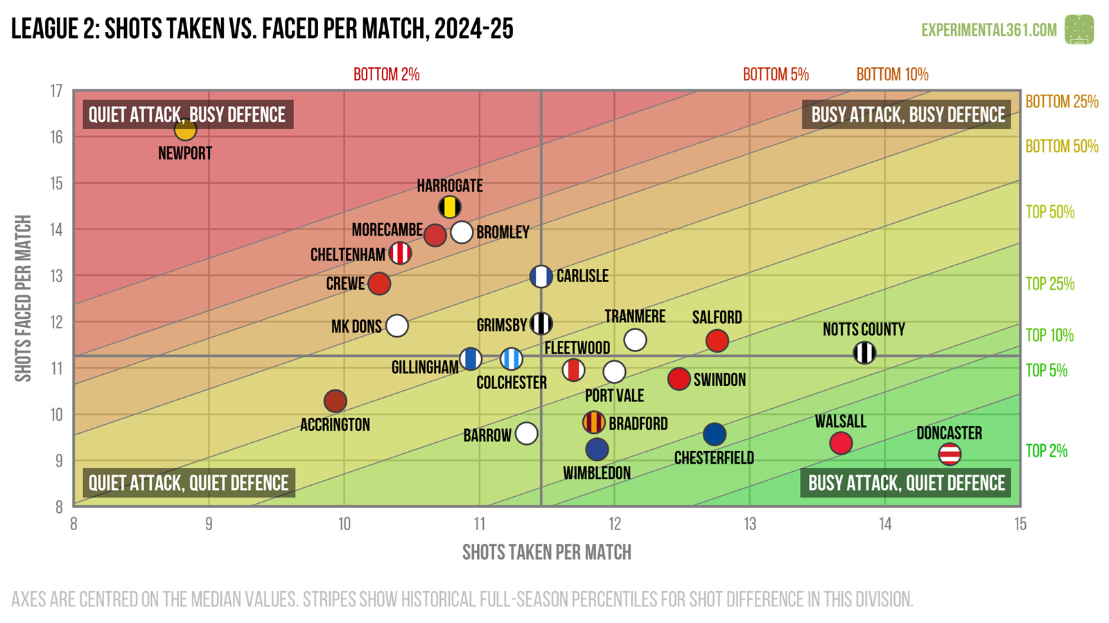
In raw shot terms, Newport look fortunate to have avoided the drop: they allowed five more shots per game than the average team while taking over two fewer in return.
While Doncaster were promoted in dominant fashion, Port Vale did not out-shoot their opponents by much and Wimbledon’s defence looks to have made the difference for them.
Attacking effectiveness
Now let’s look at attacking alone. The horizontal axis stays the same as in the graphic above, but now the vertical shows the average number of shots needed to score each league goal. Therefore bottom right is good (taking lots of shots and needing fewer efforts to convert) and top left is bad.

While Newport created the fewest chances in the league, it helped that they were one of the more clinical finishers. The two relegated teams - Morecambe and Carlisle - attempted a respectable number of shots but struggled to convert them.
Defensive effectiveness
Next let’s look at the defensive situation – basically take the above chart and replace the word “taken” for “faced” on both axes. Now top left is good (facing fewer shots and soaking up more for each goal conceded) and bottom right is bad.

Wimbledon were the league’s standout defensive performers. with only Crewe soaking up more shots for each goal they conceded.
This is where Accrington struggled this season: despite allowing their opponents fewer shots than the average team, nobody found it more difficult to repel them.
Expected goals
Finally here's a version of the first graphic that uses expected goals (xG) instead of shots, which should be a more accurate reflection of attacking and defensive quality. These are calculated using my own somewhat ancient model based on a relatively simple dataset, but in practice it tends to agree pretty well with the more advanced ones out there.

When we adjust for shot quality, Doncaster look to be deserving champions and Walsall can feel a bit hard done by.
Newport look a bit healthier here than they did in the first graphic, but along with Harrogate they need some improvements over the summer.