League Two scatter graphics - November 2024
Revisiting another classic visualisation
Subscribers and followers who are already familiar with my work pre-Substack will no doubt recognise these graphics, which are probably the ones I’m best known for.
For anyone who is seeing them for the first time, they are explained fully in this post but I will briefly recap some of that information here.
In a nutshell, there are four different graphics that compare different pairs of attacking and defensive numbers for all of the teams in the division.
Shot dominance
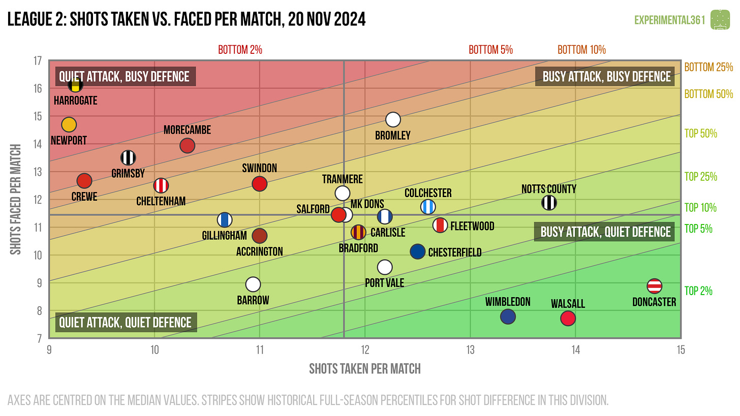
First of all, here is how the number of shots taken by each club compares with those they face in return. The average number of shots taken per match is on the horizontal and the average number faced is on the vertical, so bottom right (take plenty, allow few in return) is good while top left (take few, allow plenty) is bad.
The stripes are like contours: the greener the stripe, the better the performance (and vice versa for red). The matching labels that sit around the edges of the chart indicate how good (or bad) it is to be in each shaded area, based on the historical distribution of teams over previous seasons.
Three teams - Doncaster, Walsall and Wimbledon - have tended to dominate more than the rest when it comes to creating chances, so it’s not surprising to see all of them in promotion contention.
Interestingly Grimsby have often found themselves on the back foot (as their goal difference of -6 will attest) but are somehow sitting in seventh place.
More eyebrow-raising still are the exploits of second-placed Crewe, who have taken shots at a lower rate than all but two other teams.
Attacking effectiveness
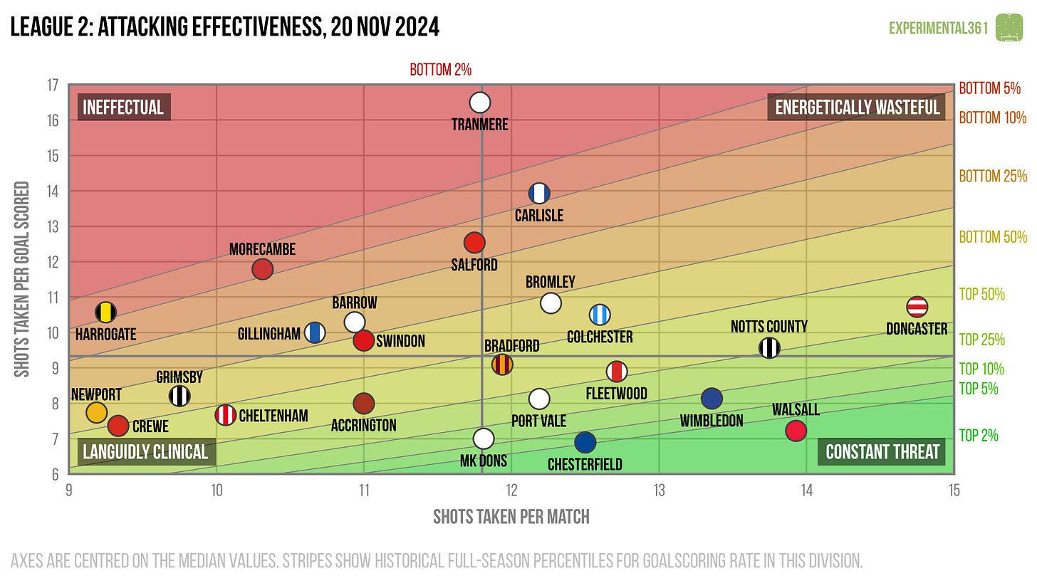
Now let’s look at attacking alone. The horizontal axis stays the same as in the graphic above, but now the vertical shows the average number of shots needed to score each league goal. Therefore bottom right is good (taking lots of shots and needing fewer efforts to convert) and top left is bad.
We have a partial answer to the Crewe conundrum here: they have made good use of the relatively few chances they’ve created.
Some of that sharpness has been missing at Tranmere, who have taken an average number of shots but converted them at less than half the rate.
Carlisle are experiencing a slightly less severe bout of profligacy but would undoubtedly be sitting a lot higher than 23rd if their finishing was closer to that of the average team.
Defensive effectiveness
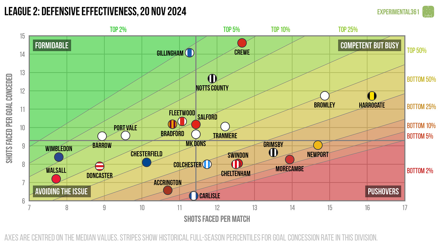
Next let’s look at the defensive situation – basically take the above chart and replace the word “taken” for “faced” on both axes. Now top left is good (facing fewer shots and soaking up more for each goal conceded) and bottom right is bad.
Crewe are also overachieving a fair bit in defence, with the division’s best rate at soaking up shots; a shade better than also-impressive Gillingham’s.
Carlisle’s nightmarish start to the season extends to this end of the pitch too, with the leakiest defence in the division. It’s taken an average of just over six attempts to score each goal against them so far.
Expected goals
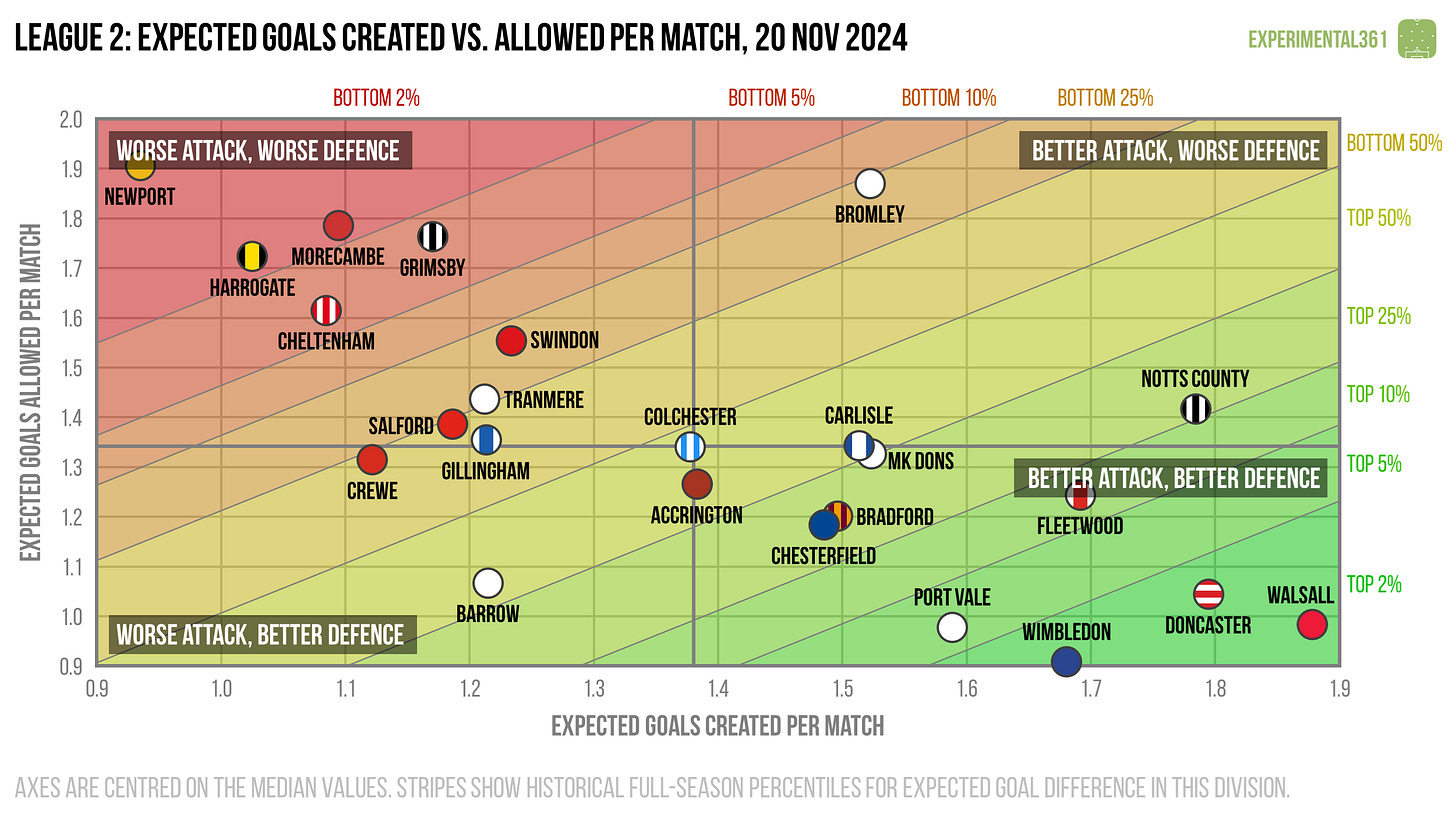
Finally here's a version of the first graphic that uses expected goals (xG) instead of shots, which should be a more accurate reflection of attacking and defensive quality. These are calculated using my own somewhat ancient model based on a relatively simple dataset, but in practice it tends to agree pretty well with the more advanced ones out there.
When we adjust for shot quality it definitely seems strange for Carlisle to be in relegation danger, seeing as they are out-creating their opponents on average.
Crewe’s lofty position continues to look out of step with their far more modest performances to date, so without a significant improvement I’d expect them to slip down the table.
Newport could find themselves dropping if they don’t improve, as they’re currently managing to hold down a mid-table place despite being among the worst performers at both ends of the pitch.


