

Premier League scatter graphics - November 2024
Revisiting another classic visualisation

Subscribers and followers who are already familiar with my work pre-Substack will no doubt recognise these graphics, which are probably the ones I’m best known for.
For anyone who is seeing them for the first time, they are explained fully in this post but I will briefly recap some of that information here.
In a nutshell, there are four different graphics that compare different pairs of attacking and defensive numbers for all of the teams in the division.
Shot dominance
First of all, here is how the number of shots taken by each club compares with those they face in return. The average number of shots taken per match is on the horizontal and the average number faced is on the vertical, so bottom right (take plenty, allow few in return) is good while top left (take few, allow plenty) is bad.
The stripes are like contours: the greener the stripe, the better the performance (and vice versa for red). The matching labels that sit around the edges of the chart indicate how good (or bad) it is to be in each shaded area, based on the historical distribution of teams over previous seasons.
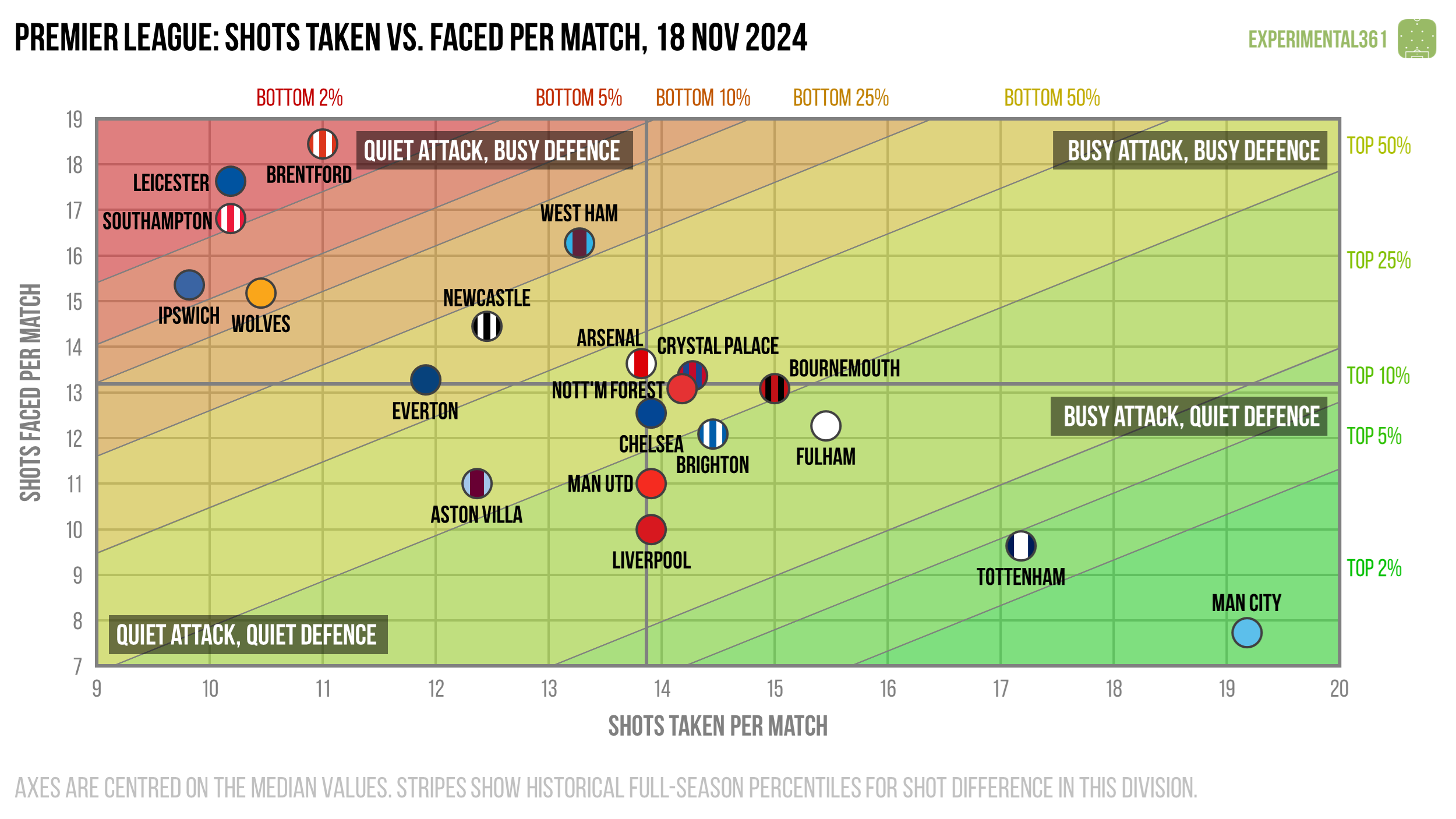
In pure shot terms, Manchester City and Tottenham have out-gunned the rest of the league by a pretty wide margin, despite their respective dips in form.
I was surprised to see that Arsenal have taken almost the exact same number of shots as their opponents, which is pretty unusual for a title challenger.
There is a cluster of five teams in the top right - the three newly-promoted sides plus Wolves and mid-table Brentford - who tend to get out-shot far more than the rest of the league.
Attacking effectiveness
Now let’s look at attacking alone. The horizontal axis stays the same as in the graphic above, but now the vertical shows the average number of shots needed to score each league goal. Therefore bottom right is good (taking lots of shots and needing fewer efforts to convert) and top left is bad.
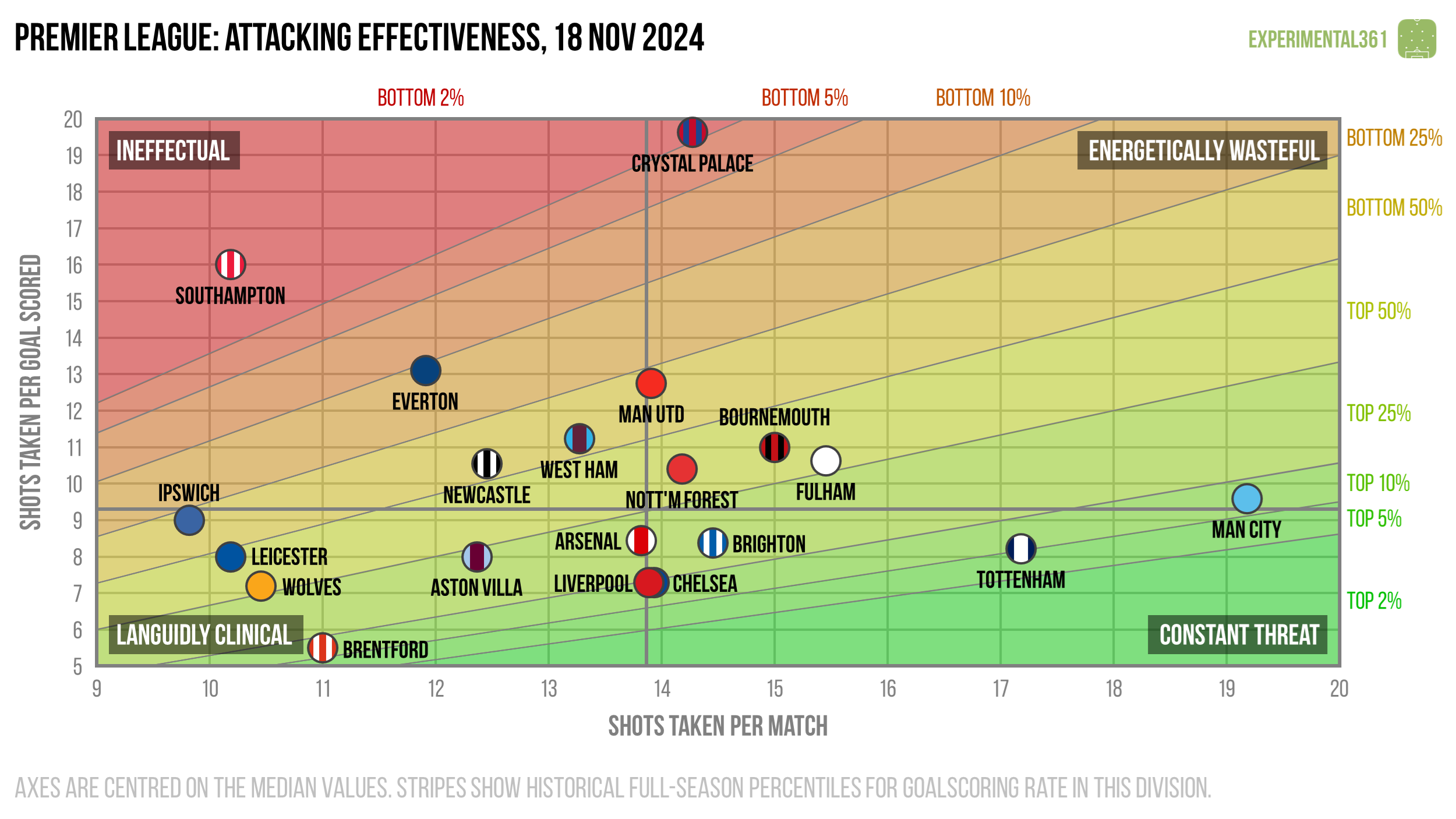
While Spurs and Man City are creating a lot more chances than anyone else, they’re far from the most efficient at converting them.
However neither have been terrible at turning shots into goals, which unfortunately cannot be said for Crystal Palace. They are the big outlier here, having created a respectable number of chances while struggling to convert them.
The extent to which Palace’s shot conversion lags the rest of the league (apart from struggling Southampton) suggests that they have either been taking some absolutely awful shots or have been unlucky in front of goal so far.
Defensive effectiveness
Next let’s look at the defensive situation – basically take the above chart and replace the word “taken” for “faced” on both axes. Now top left is good (facing fewer shots and soaking up more for each goal conceded) and bottom right is bad.
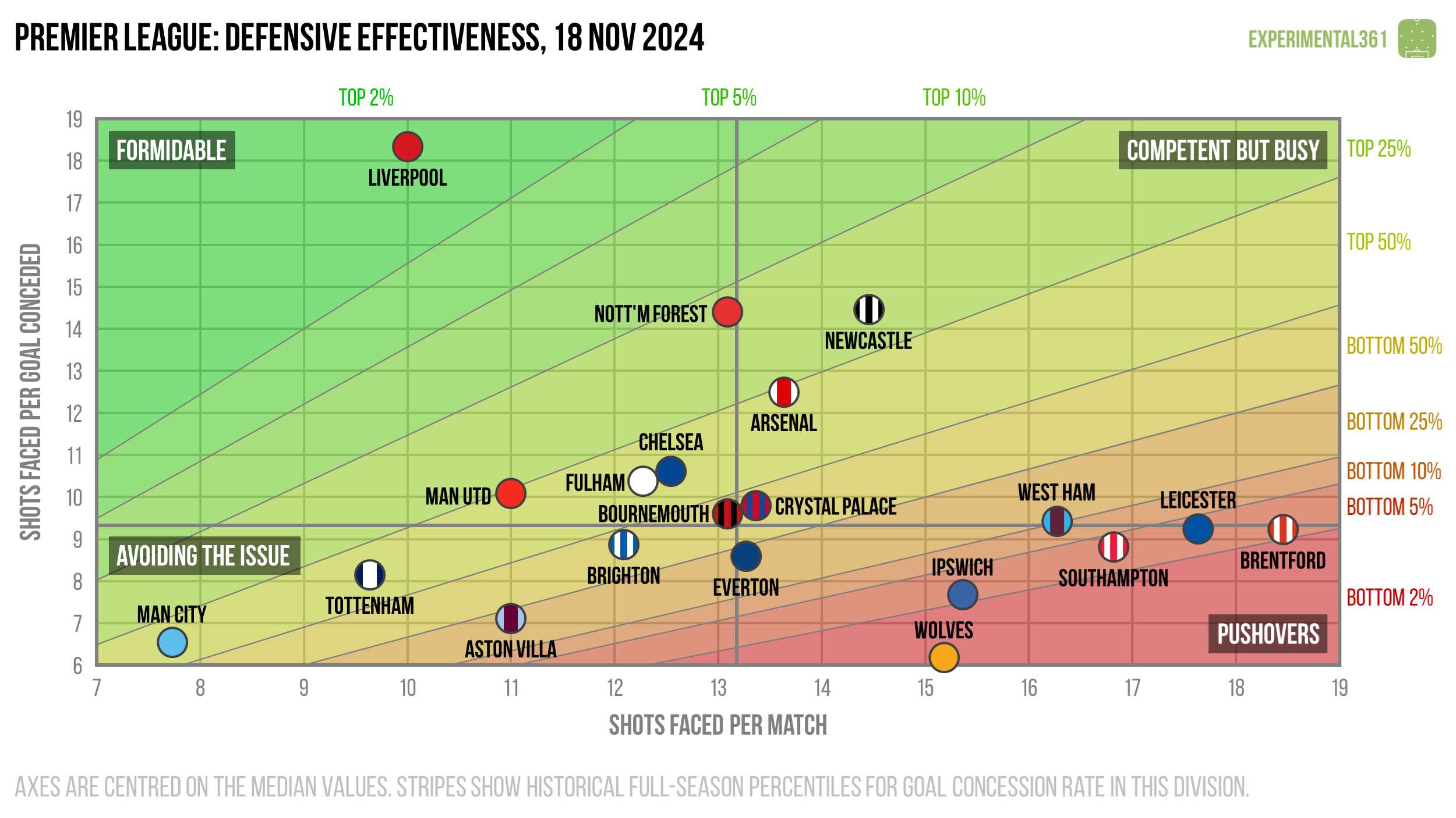
Liverpool’s defence has been excellent this season. While they are unlikely to sustain that impressive ratio of over 18 shots faced per goal conceded over the full campaign, the relatively few chances they allow should stand them in good stead.
Nottingham Forest and Newcastle have also been pretty resilient at the back despite their defences having a lot more to do.
Expected goals
Finally here's a version of the first graphic that uses expected goals (xG) instead of shots, which should be a more accurate reflection of attacking and defensive quality. These are calculated using my own somewhat ancient model based on a relatively simple dataset, but in practice it tends to agree pretty well with the more advanced ones out there.
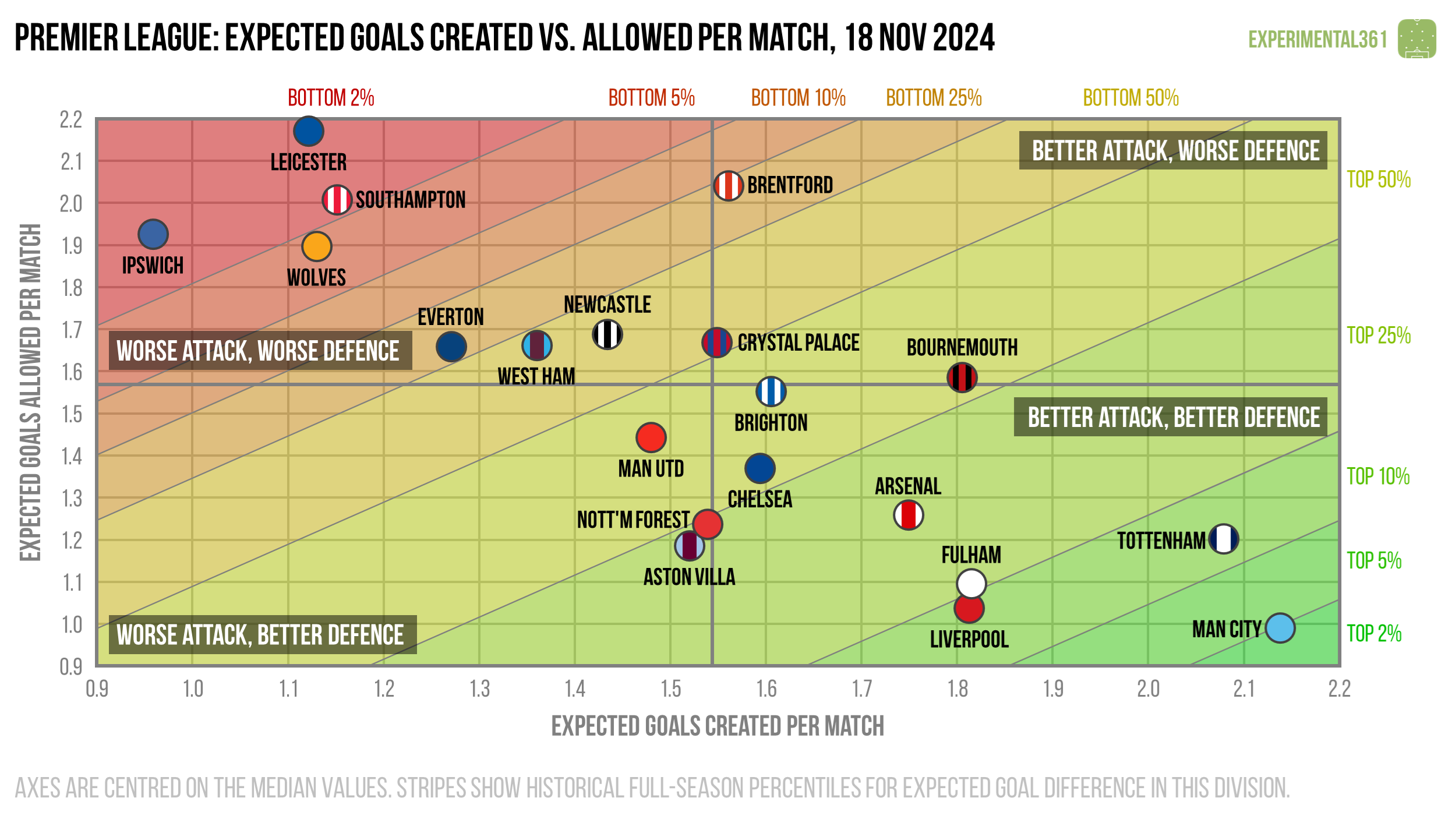
Spurs and Man City still lead the way in attack but look somewhat less exceptional.
Fulham are having a great season at both ends of the pitch so far, matching the performances of Liverpool. My expected goals model has been a bit kinder to their attack than some of the others I’ve seen, but there’s broad agreement on how impressive their defence has been.
Meanwhile Brentford’s back line appears to be letting them down this season, allowing chances of similar quality to the teams battling relegation.
The Crystal Palace attack looks to be performing at a respectable level, so I expect that their goalscoring rate will improve as time goes on.