

Minute-by-minute tables, 2024-25
How would the league look if games had finished earlier?

I’m on a bit of a roll (at least by recent standards) in creating new graphical templates for next season and have been able to get rid of something that’s been languishing on the “to do” pile for years.
Last week’s look at game states highlighted teams who had spent lots of time leading but finished low in the table (and vice versa), and it wasn’t easy to figure out how that had happened. One way to dig into this is to recalculate the league table only using goals scored and conceded up to a certain minute, as this shows the impact of a team’s performance at different stages of their matches. There’s a page on Transfermarkt that lets you do this with any combination of 15-minute segments.
However, I was interested in being able to stop the clocks at any minute and pinpoint when each club was at its highest and lowest. That’s a bit of a data visualisation challenge: for a 24-team division with 90 minutes to cover (assuming we roll up stoppage time into the 45th and 90th) that’s over 2,000 numbers to display.
A big colour-coded table is one way to approach it, but that’s asking the audience to do a lot of reading and the patterns don’t exactly jump off the page. Previously I’ve gotten around this by using animated GIFs or videos to plot the data for one team at a time, but that requires a lot of tedious skipping and pausing.
Emboldened by cramming a lot of information into last week’s squad age profiles, I was determined to fit a minute-by-minute position chart for every team in a division onto a single page that’s viewable on a phone screen (admittedly perhaps with a bit of pinching and zooming required to see the finer detail).
Here’s an example of how they work. At the top we have the team’s finishing position (in this case 6th) and name, below which I’ve picked out an interesting time interval.
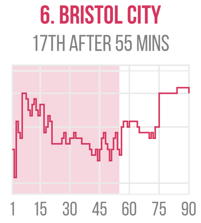
Below is the team’s chart: from left to right it plots the club’s league position if every game had ended after one minute, two minutes etc all the way up to full-time. The first one on each page has 15-minute intervals indicated.
I’ve drawn in some hopefully obvious horizontal lines to indicate the automatic promotion, play-off and relegation zones, along with the middle of the table. I didn’t add labels down the side for positions as they squashed the charts too much.
The shaded area illustrates the elapsed time up to the interesting interval I’ve picked out above each chart. I originally tried to add a dot to the colour-coded line, but I couldn’t make these big enough to be obvious when zoomed out without covering a big chunk of the pattern. I therefore opted for shading, which I think works better and adds an extra splash of colour.
Putting this all together for our example, we can see that Bristol City became a lot more effective towards the end of matches, going from lower mid-table to the play-offs via a couple of big jumps after 56 and 75 minutes. I checked the raw data and the net result of their efforts after the 55th minute added 15 points to their final total.
Let’s now take the traditional downwards route through the top four English divisions, in which I’ll pull out a couple of examples for each.
Premier League
If you threw away all of the goals scored in the last 30 minutes of Premier League games this season then Arsenal would be champions, with 76 points to Liverpool’s 74. The Reds made the last half an hour of their games count, with a net gain of 10 points. Wind the clock back further to 49 minutes and Man City would have the best record (ahead of the Gunners on goal difference.
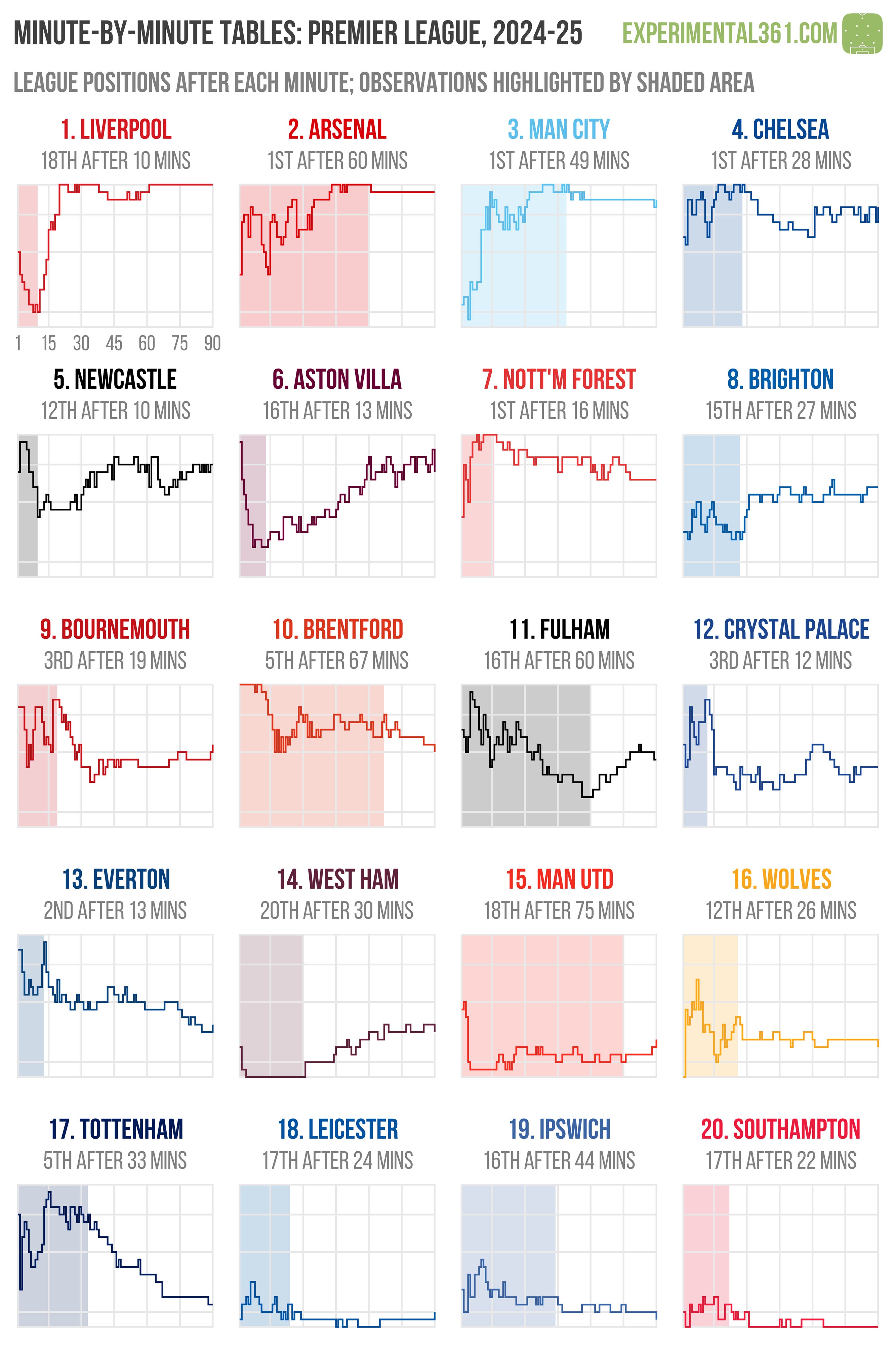
West Ham had some serious problems at the start of games this season: they were the league’s worst performers during the opening half-hour. After 30 minutes they had a combined tally of 30 points (i.e. having lost eight from their opening balance of 38, with every game starting at 0-0).
Aston Villa were also slow starters: with 13 minutes on the clock they were the league’s fifth-worst team but got gradually better as time went on. Brighton look to have clicked between the 28th and 32nd minutes of their matches, during which they made a net gain of 10 points.
There were plenty of teams who peaked early, with Nottingham Forest having the league’s best record after 16 minutes of action (racing to 56 points at this stage) and Chelsea likewise with 28 minutes on the clock (62 points).
Note: As there’s no promotion from the top flight, I’ve draw the first horizontal line in 5th place i.e. Champions League qualification.
Championship
As we saw in the example above, Bristol City made it into the play-offs despite having a mid-table record until relatively late on. Stoke also tended to get their act together towards the end of matches: after 73 minutes they had the league’s joint-lowest points tally (only ahead of Plymouth on goal difference) but gained a net 10 points over the rest of their games.
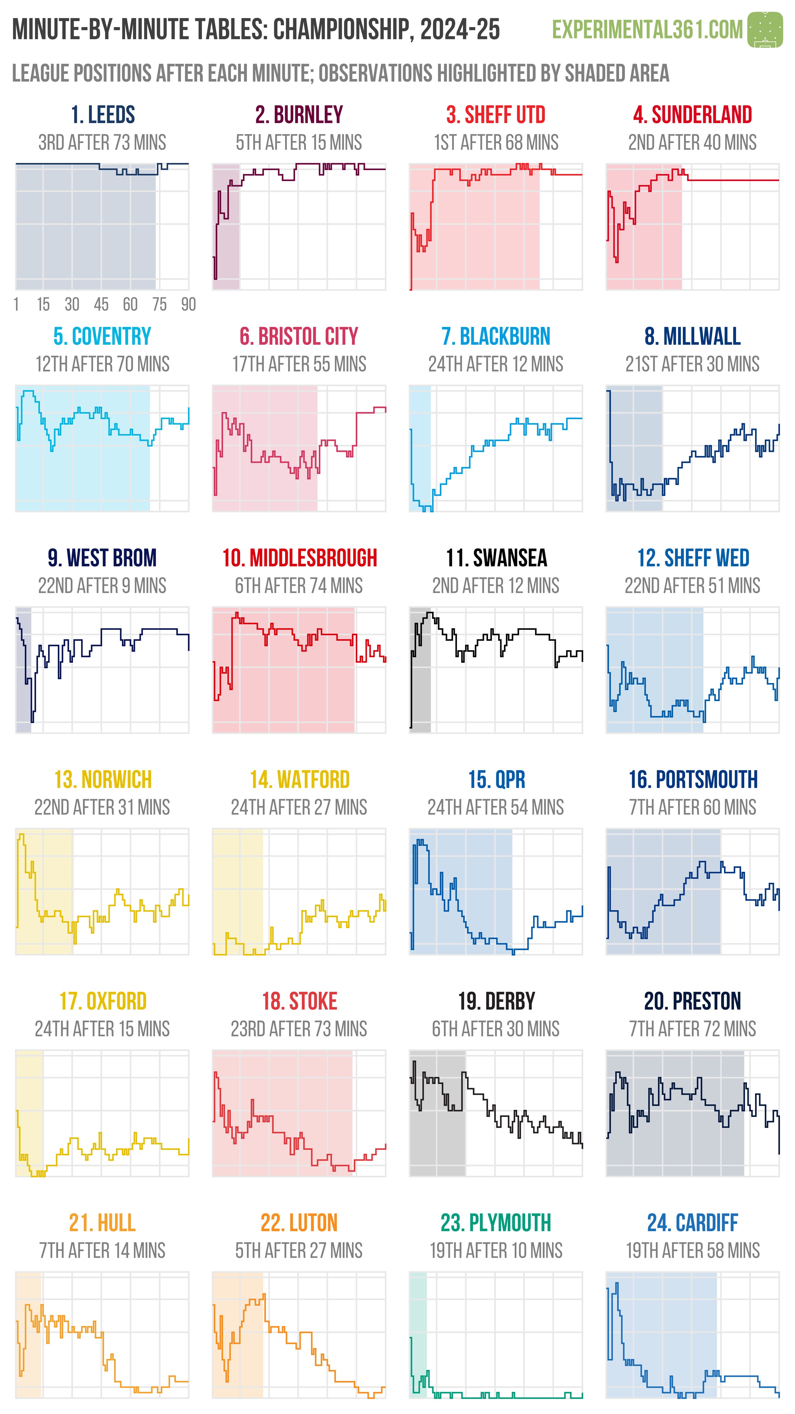
While a number of other teams peaked early, the one that really stands out for me is Preston, whose late-game struggles almost resulted in relegation. After 72 minutes I have them on 64 points (just four below the play-off places), but they ended up just one point above the drop zone.
Derby were often unable to protect the gains from their strong early performances. Their chart shows a gradual decline after the first half an hour of play, which saw them shed a net total of 12 points. Game management also appears to have been an issue for relegated Luton, who often started well. The first 27 minutes of their games yielded a combined 61 points, which is 12 more than they ended up with.
League One
Wrexham’s second consecutive promotion may not have happened without their ability to finish games strongly. After 55 minutes of play they’d only banked 68 of their eventual 92 points, at which stage Birmingham already had 94 on the board.

Charlton also stood out for their ability to eke out results late in games, gaining 20 points after the 67th minute and rising from 11th to 4th in the process. I also have to applaud Bolton, who stood out in the game states analysis for finishing 8th despite spending far more time losing than winning. To say they peaked late in games would be an understatement: if only goals scored in the first 59 minutes counted then they’d have been relegated, with their points tally increasing from 47 to 68 thereafter.
The last half an hour of Barnsley’s fixtures went in the opposite direction as they slipped from automatic promotion to mid-table, shedding a combined 17 points.
League Two
Play-off finalists Walsall and Wimbledon both had interesting trajectories. The Saddlers tended to perform poorly in the opening half-hour of games before recovering, while Wimbledon had the best record in the division until late on.
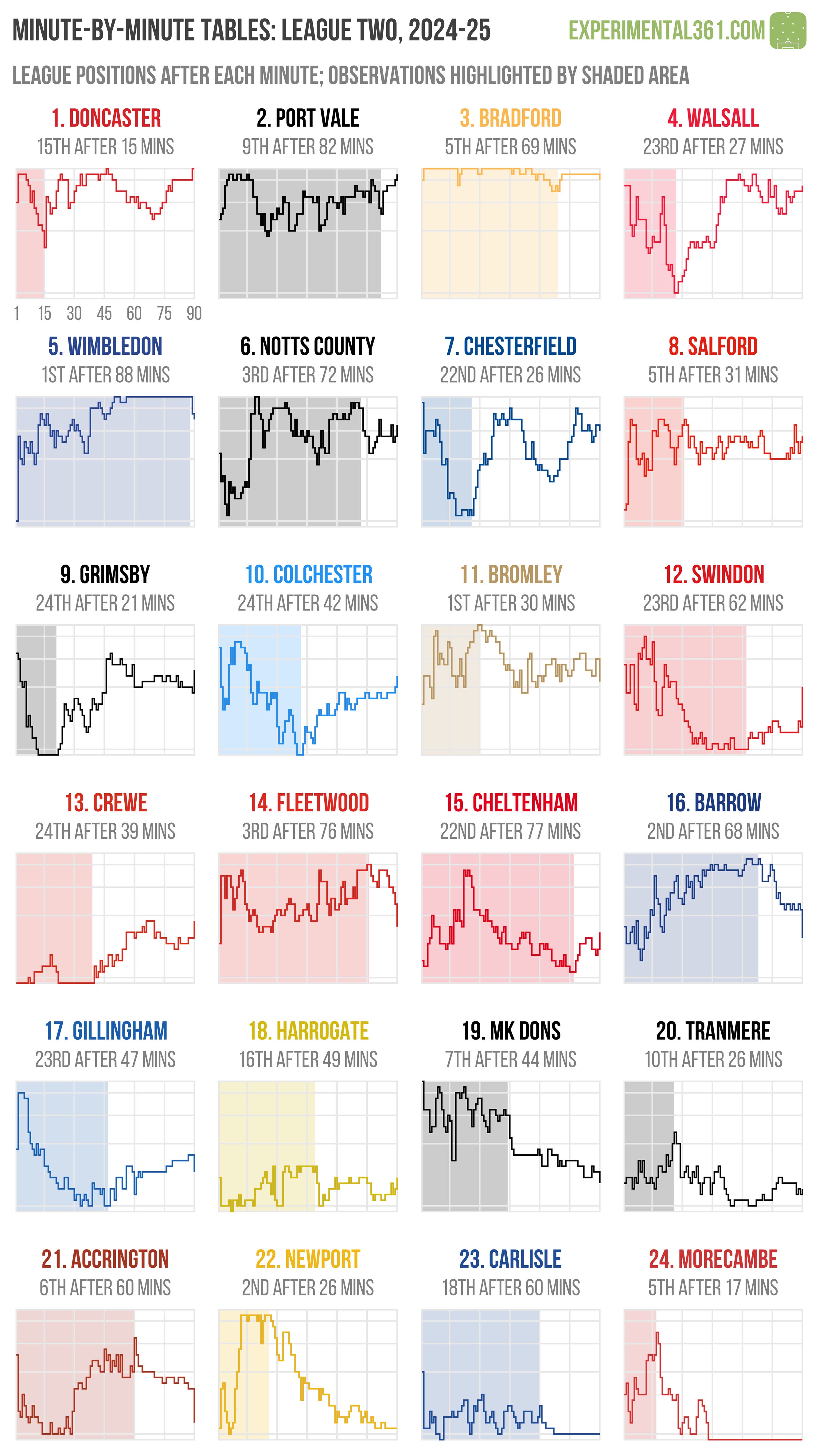
I highlighted Barrow as an unusual team when looking at game states last week. Despite their lower mid-table finish, only five teams had a better balance of time spent winning versus losing. Now we can see what happened: with 68 minutes on the clock they had 76 points (good enough for second place), but collectively lost 17 points over the remainder of their matches.
It was a similar story for Fleetwood, who had the 3rd best record after 76 minutes but fell away sharply towards the end of games. They were also ahead a lot more often than they trailed this season. This was also the case with Bromley, who had the league’s best record after 30 minutes.
Swindon’s games often went the opposite way. Despite ending their campaign in mid-table, only three teams had a worse balance of time spent losing versus winning. They collectively gained 16 points in the last half-hours of games and 11 of these were added after the 89th minute, suggesting a lot of last-ditch efforts that paid off.
Wow what a brilliant idea. And beautiful visuals. Great work 👏
Very strong way to visualize the data! Not only is it clear to understand but also intuitively lines up with what we see on the pitch as fans. I will definitely (if you don’t mind) use some of these in my future posts about Villa as they are too good not to use. Keep up the good work!!