Scatter graphics: visualising attacking and defensive performance
Revisiting another classic visualisation for the Premier League and EFL
One of the first “proper” visualisations I ever created, way back in early 2012, were scatter graphics. I had used them all the time in my degree and subsequent day job to quickly compare multiple things at once, but hadn’t seen them in sports coverage.
Over the course of multiple iterations they’ve become one of my all-time favourites and probably the thing I’m known best for, so it was an easy choice to rattle them out once again. Now that a sufficient chunk of the season has elapsed, I’ve created versions for each of the top four tiers of English football.
Rather than inundating this post with all of the graphics for each division, I thought it would be less annoying to just cover the most interesting ones here and hive off the rest for those who are interested. In each section below there’s a link to a separate post containing the full set of graphics for that division with accompanying commentary.
Like many football data accounts, I’ve made the move from Twitter to Bluesky recently and will also be posting all of the graphics over there for anyone who wants to discuss them.
Premier League
First of all, here’s the link to the full set if you wanted to get stuck into them.
The most interesting one for me was the attacking picture, comparing the number of shots taken by each team with the rate at which they’ve converted these into goals.
While it’s not as precise as using expected goals (which weren’t a thing when I first started making these), you can still glean some useful insights from simple shot data.
The obvious outlier here is Crystal Palace, who have so far failed to reproduce their impressive results from the end of last season. Their profligacy in front of goal has been a significant contributor to their poor start: needing over 19 attempts to score a goal - around double the average - is pretty horrific.
Fortunately for them, it is also generally not sustainable over a season, and a glimpse at the expected goals graphic in the full Premier League post shows that they’re not taking particularly bad shots. Therefore I suspect that bad luck is likely to have played a part in their poor chance conversion rate.
Championship
Again, here’s the link to the full set if you’d prefer to dive straight into those.
In the second tier it was the defensive chart that caught my eye, with several teams having sustained some pretty heroic levels of resilience so far.
Burnley and Sheffield United have both soaked up over 20 opposition shots for each goal they have conceded this season. Usually such huge outliers don’t remain so over a full 46-game season, but as they have been adept at restricting the number of chances their opponents create I doubt that either will suffer a defensive collapse.
The Clarets’ defence is doing the lion’s share of the work in keeping the team in promotion contention. As the other graphics in the full post show, their attack has been among the quietest in the division so far.
League One
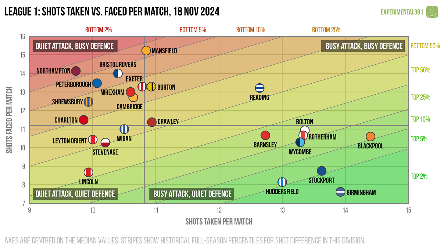
Once again I’ll begin by sharing the link to the full post. For this division the simplest graphic ended up being the most interesting, as it divides quite neatly into teams who take at least 12 shots per match and those who can’t muster more than 11.
While many of the teams with more productive attacks are competing in the top half of the table, there are some notable exceptions.
Wrexham, Lincoln and Mansfield are all challenging for promotion despite being relatively shot-shy. Those who delve into the post will see that this is due to some clinical finishing rather than a focus on quality over quantity, so it will be interesting to see if any of them can sustain this level over the full campaign.
Meanwhile Rotherham are in the opposite camp: they create plenty of goalscoring opportunities (which stack up quality-wise when we whip the xG lens out), but have struggled to convert them.
League Two
Finally - and once again alongside a link to the full post - we come to the fourth tier.
This time it was the expected goals comparison which caught my eye, as there are several teams in unusual positions.
Carlisle currently sit 23rd in the table but that’s where their similarity to relegation battlers ends. They’ve been carving out chances of above-average quality and haven’t been slouches at the back either, but their execution has let them down at both ends of the pitch.
As you’ll see if you read the full post linked above, they’ve suffered with the leakiest back line in the league and their attack has also been one of the most wasteful.
Meanwhile Crewe sit second in the table despite some relatively modest performances, thanks in particular to some heroic defending. It was also surprising to see Newport sitting comfortably above the relegation zone despite being among the worst performers at both ends of the pitch, so both of these teams could well find themselves sliding downwards unless things change.


