

Premier League scatter graphics: 2024-25
A full-season comparison of attacking and defensive performance

For anyone who is seeing them for the first time, they are explained fully in this post.
Shot dominance
First of all, here is how the number of shots taken by each club compares with those they face in return. The average number of shots taken per match is on the horizontal and the average number faced is on the vertical, so bottom right (take plenty, allow few in return) is good while top left (take few, allow plenty) is bad.
The stripes are like contours: the greener the stripe, the better the performance (and vice versa for red). The matching labels that sit around the edges of the chart indicate how good (or bad) it is to be in each shaded area, based on the historical distribution of teams over previous seasons.
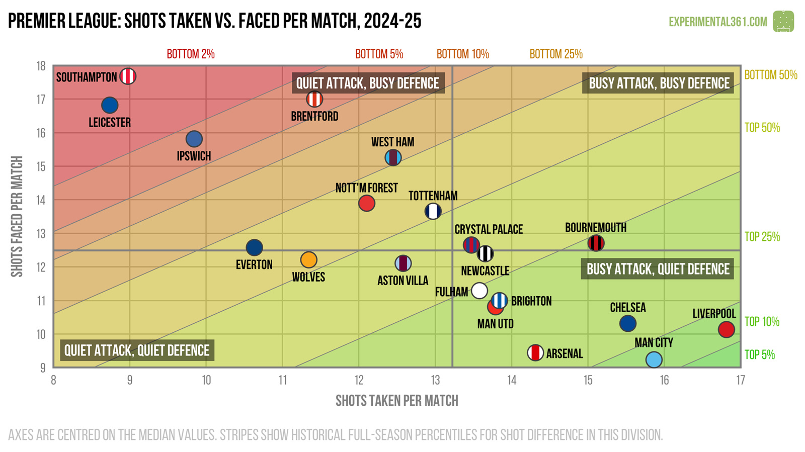
The promoted - and subsequently relegated - trio of Southampton, Leicester and Ipswich struggled to impose themselves on games. However it was interesting to see Brentford allow so many shots.
The top four stood out as the most dominant teams, and despite their terrible season Man Utd had one of the healthier shot differences in the league.
Attacking effectiveness
Now let’s look at attacking alone. The horizontal axis stays the same as in the graphic above, but now the vertical shows the average number of shots needed to score each league goal. Therefore bottom right is good (taking lots of shots and needing fewer efforts to convert) and top left is bad.
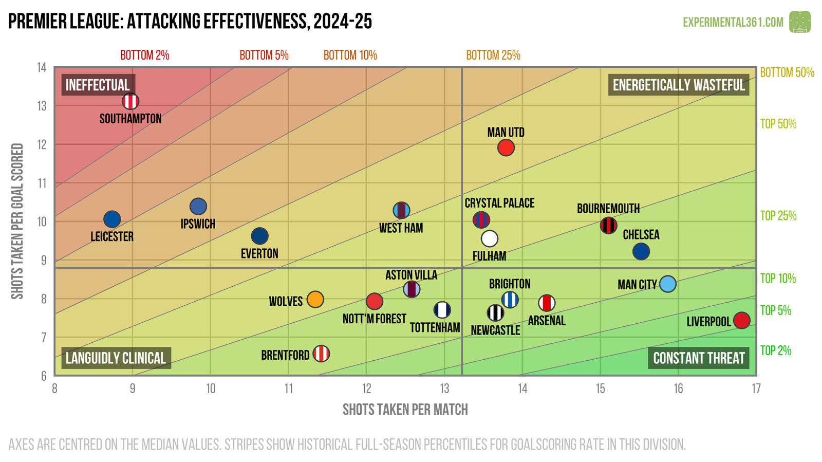
Despite taking an above-average number of shots, Man Utd were among the league’s most wasteful finishers, second only to bottom club Southampton. As we’ll see a bit further down, their shooting was definitely “quantity over quality” this season.
Defensive effectiveness
Next let’s look at the defensive situation – basically take the above chart and replace the word “taken” for “faced” on both axes. Now top left is good (facing fewer shots and soaking up more for each goal conceded) and bottom right is bad.
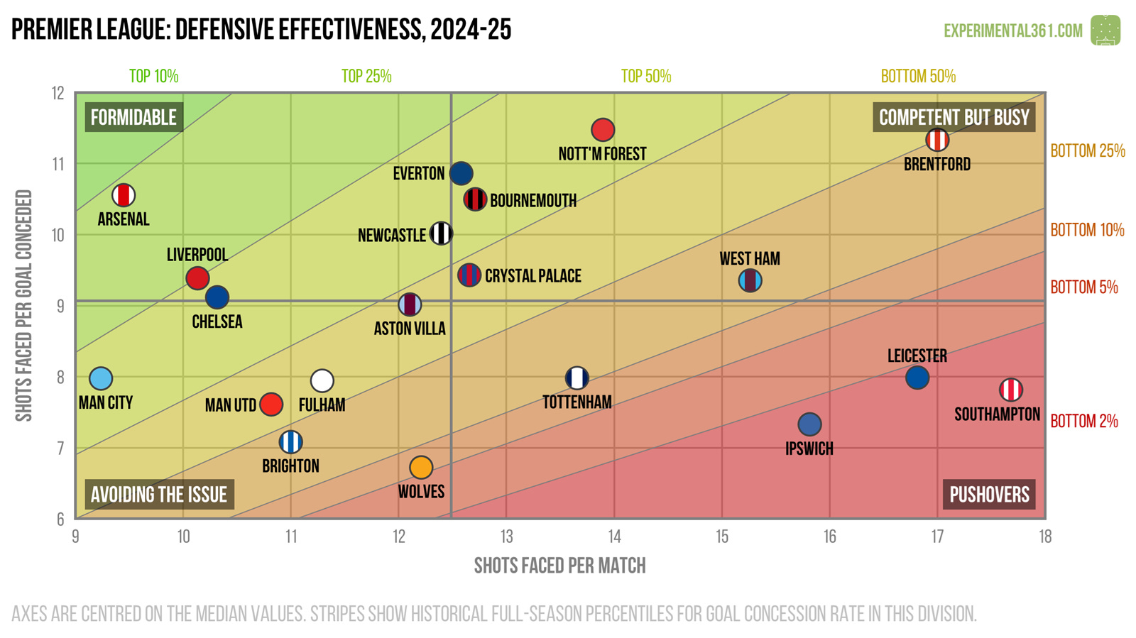
This is another chart in which the bottom three stand out for the wrong reasons - they were all worse than average at dealing with shots while also facing a lot of them.
Brentford meanwhile were able to soak up a lot of opponent efforts for each goal conceded, on a par with surprise package Nottingham Forest.
Expected goals
Finally here's a version of the first graphic that uses expected goals (xG) instead of shots, which should be a more accurate reflection of attacking and defensive quality. These are calculated using my own somewhat ancient model based on a relatively simple dataset, but in practice it tends to agree pretty well with the more advanced ones out there.
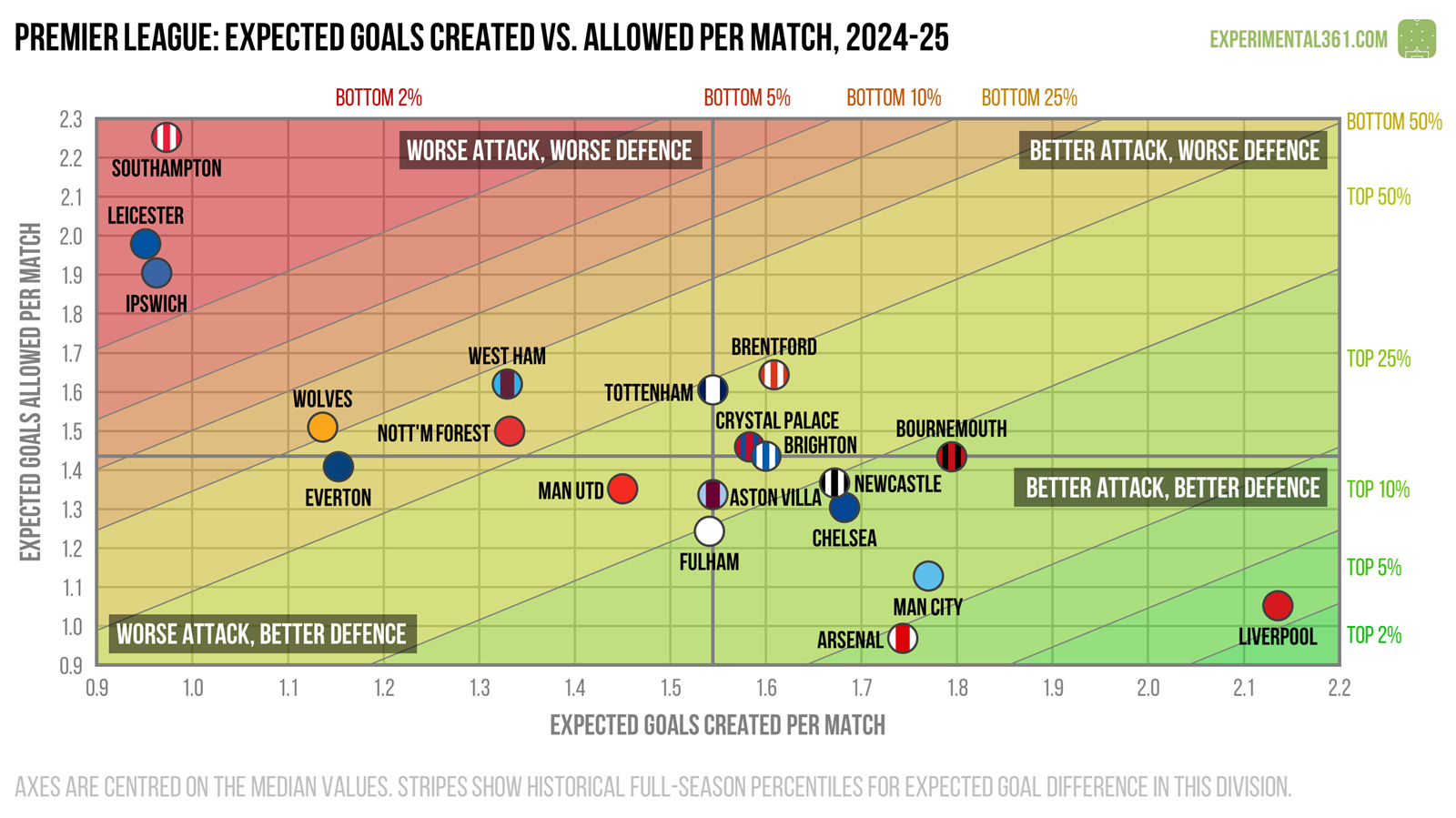
When we adjust for shot quality, Liverpool’s attack stands out as the best by quite some distance, while the three relegated teams stretch the diagram in the opposite direction.
It’s a surprise to see Nottingham Forest in the below-average section of the chart after a successful season. I thought it might just be my stone-age model’s fault, but I can see similar negative xG differences elsewhere. How they start next season may help to determine whether they’ve been on an unsustainable hot streak or were doing something interesting that the shot data doesn’t fully capture.