

Championship scatter graphics - 2024-25
A full-season comparison of attacking and defensive performance

For anyone who is seeing them for the first time, they are explained fully in this post.
Shot dominance
First of all, here is how the number of shots taken by each club compares with those they face in return. The average number of shots taken per match is on the horizontal and the average number faced is on the vertical, so bottom right (take plenty, allow few in return) is good while top left (take few, allow plenty) is bad.
The stripes are like contours: the greener the stripe, the better the performance (and vice versa for red). The matching labels that sit around the edges of the chart indicate how good (or bad) it is to be in each shaded area, based on the historical distribution of teams over previous seasons.

Leeds were the most dominant team by far in raw shot terms, taking two more per game on average than anyone else and allowing noticeably fewer than Burnley’s excellent defence.
It’s unusual to see a team create as many chances as Middlesbrough without at least finishing in the play-off zone.
Attacking effectiveness
Now let’s look at attacking alone. The horizontal axis stays the same as in the graphic above, but now the vertical shows the average number of shots needed to score each league goal. Therefore bottom right is good (taking lots of shots and needing fewer efforts to convert) and top left is bad.

Leeds’ monster attack set the standard this season: not only did they create the most chances but were also one of the more clinical finishers.
Burnley and Norwich were similarly efficient in front of goal from a far more modest shot total. Interestingly, Cardiff were relegated despite taking more shots than the promoted Clarets.
Defensive effectiveness
Next let’s look at the defensive situation – basically take the above chart and replace the word “taken” for “faced” on both axes. Now top left is good (facing fewer shots and soaking up more for each goal conceded) and bottom right is bad.
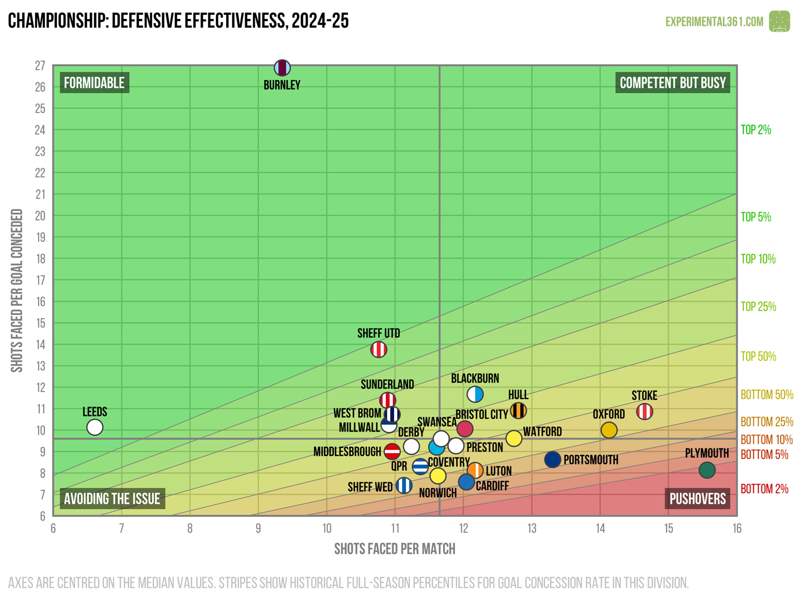
The Burnley defence was so good that I had to make this chart taller, as otherwise the remaining teams would have been squeezed into an illegible mess.
Stoke’s defence kept them out of trouble this season, as they fared poorly on the two previous charts but benefited from some above-average resilience at the back.
Expected goals
Finally here's a version of the first graphic that uses expected goals (xG) instead of shots, which should be a more accurate reflection of attacking and defensive quality. These are calculated using my own somewhat ancient model based on a relatively simple dataset, but in practice it tends to agree pretty well with the more advanced ones out there.

When we adjust for shot quality it’s a similar story to the first chart, with Leeds way out in front of everyone else. It’s hardly controversial to point out that Burnley’s defence was the key to their success.
Oxford’s attack may need some fresh ideas if they’re to avoid a relegation battle next season, while Stoke look like they need a more effective means of disrupting their opponents.
Leeds and Burnley messing with your charts is yet another argument against parachute payments...