

Plans for 2025-26, plus a belated season wrap-up

To say that I’ve had a slow start to 2025 is a bit of an understatement (sorry about that), but there will be a lot more activity in the second half of the year.
I’ve greatly missed running Experimental 361, so was delighted to have passed the 1,000 subscriber mark despite the recent lack of activity. I want to figure out whether there’s still a place for it and have put together a plan that I can scale up from if things go well.
What to expect over the coming weeks (and months)
When the Premier League and EFL fixtures are released over the next few weeks, I’ll be creating my usual fixture difficulty matrices. These highlight tough and easy runs of games for each team over the season based on the latest betting odds; here’s last year’s version as a reminder.
There will also be the usual tracking of squad retention for each team in the top four divisions. It will look very similar to this version from last season and the first iteration should be published within the next week.
Otherwise I’ll be using the summer break to try out some new graphical templates using last season’s data. There are already a couple in the works.
I’ll be creating quite a few individual posts to keep their sizes manageable, but to avoid clogging up inboxes I’ll only ever send out a handful of emails per week summarising and linking to everything that’s been added.
With the announcements out of the way, it’s time for a belated information dump.
Who were the youngest (and oldest) teams last season?
I’ve renovated one of my previous graphics that looks at squad age. These were a staple of the old blog but were due a makeover, so I’ve added a few extra bells and whistles to make comparisons between clubs easier. They now look like wonky 8-bit spaceships rather than factory-damaged lava lamps:
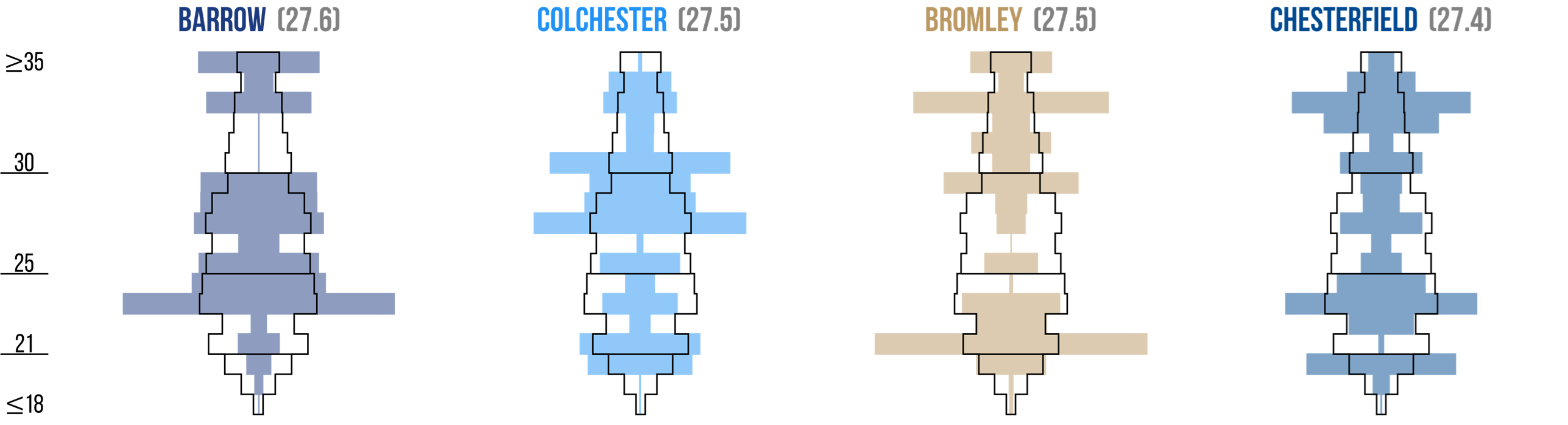
You can view the full post covering all Premier League and EFL clubs - along with an explanation of how the graphics work - here.
Summarising attacking and defensive performance
I realised that I hadn’t updated the classic scatter graphics since late 2024, so there are now full-season versions for 2024-25: four for each of the top four divisions. Here’s a quick zoomed-out preview, with the links to the individual posts below:
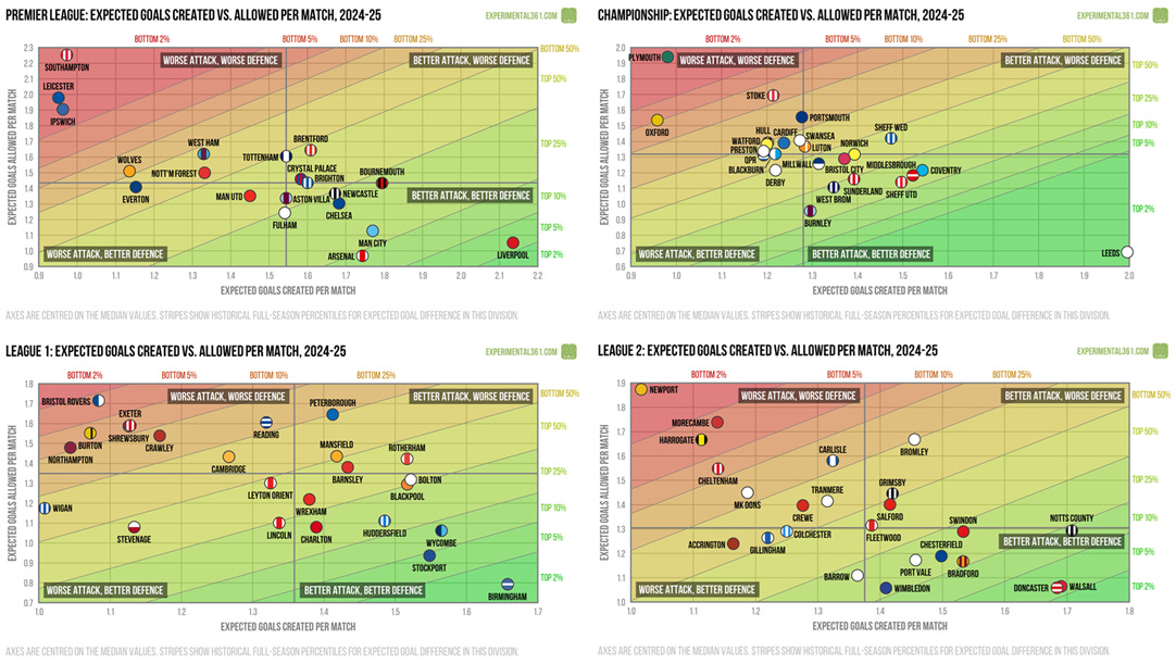
Premier League - Brentford were one of the most efficient sides at both ends of the pitch, while wasteful shooting was a problem for Man Utd.
Championship - Leeds were the standout performers, but Burnley’s defence was so good that I had to stretch one of the graphics out.
League One - Defensive resilience looks to have been key to Wrexham’s success, whereas the lack of it was costly for Crawley.
League Two - Some clinical finishing from Newport’s attack kept them out of trouble this season, while Harrogate can thank their defence for doing likewise.
A few other quick visualisations
I was also able to churn out a couple of simpler posts while I was rummaging around in the data:
A breakdown of how much time everyone spent winning, drawing and losing last season. As usual there are a few surprises in there, such as Barrow finishing 16th despite only four teams leading for longer overall.
Here are each club’s footprints, summarising how they each moved around the league table over the course of the season. All four divisions had only one team who never finished a day outside the top half of the table and two who never reached it.